White Space
Bed Bath & Beyond
bedbathandbeyond.com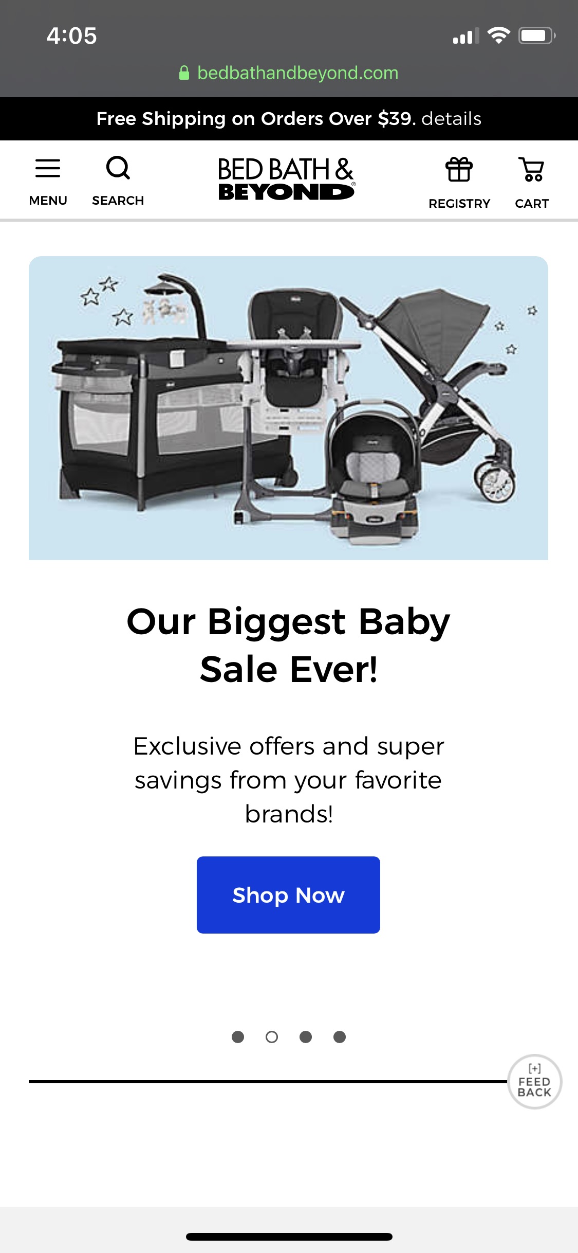
The principle of white space is shown within this screen shot because of the white around all of the items. The header is white with icons and a logo that stand out more because the white background behind them.
The white space continues on the next section with a picture with white background. The picture could fill the whole space but instead they used the white background and a smaller picture to create white space within the design.
The button to shop with the words above it stand out more because of the white space around them. The use of white space is very appearent throughout the whole front page of the website.
Alignment
Yahoo
yahoo.com
This screenshot from Yahoo's homepage is a great example of alignment. As you can see the pictures on the left are aligned in a column with each picture the same size and shape with equal distance apart.
Also, the text to the right of each picture is perfectly aligned to the left. The text is also aligned with the top of each picture as well.
This homepage is a great example of alignment and shows how to use it to create order and visual interest within a webpage.
Contrast
Puma
in.puma.com
Contrast is a benefical tool within design and Puma does a great job at showing contrast throughout their homepage. The first element of contrast is the white icon in the top left on the black header. This makes their icon stand out and is very noticeable.
The next contrast is the white sales tag in the middle of the screen with the red background behind it. This makes the sales tag become the focal point of this web page and creates visual contrast for the viewer.
The last contrast would be the black words on the white background below the img. This contrast makes the text readable and eye catching to the reader. Contrast is used to help the viewer see the important details first and is visually interesting to the eye. Puma has done a great job at making that happen.